Gravel, Brick or Stepping Stones: Reading a Garden Surface
Compare gravel, brick, and stepping stones by texture, color, and visual rhythm to choose a garden surface that suits the mood of a particular space.
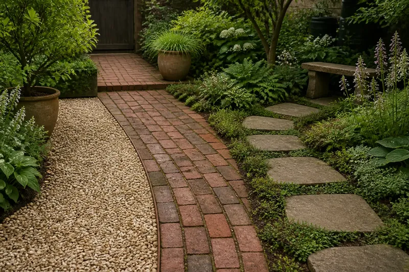
Gravel, brick, and stepping stones can make the same small garden feel loose, orderly, or deliberately quiet. Stand at the back door and look down: a pale gravel strip catches light, a brick walk draws a clear line, and separate stones leave patches of planting visible between each step. Reading a garden surface begins with those impressions, before questions of layout or installation.
Gravel’s shifting texture
Gravel is visually active even when nothing is moving. Small stones break up a broad area into many flecks, so the eye reads the ground as textured rather than as one solid plane. From a window, that fine pattern can give a plain side yard more detail without competing with the leaves above it.
Color changes the character. Cream or buff gravel often lifts a shaded corner; charcoal gravel can make bright foliage stand out, but may feel weighty beside dark soil and evergreen leaves. Mixed tones soften the effect, though they can also make a space look busier. Hold a handful beside the plants and paving already there, rather than judging a sample alone.
Gravel’s loose appearance suits gardens where edges are informal: a border that feathers into the path, a group of pots, or plants with fine stems and small leaves. Beside crisp clipped shapes, the contrast can be pleasing. If both the planting and the ground are visually restless, though, the view may lack a place to settle. A simple border or a quieter neighboring surface can give the eye a rest.
Look at the stones in different light. A surface that seems pale under a cloudy sky may flash in direct sun; wet stones can appear darker and more unified. The important question is not whether the material is attractive in isolation, but whether its changing grain supports the garden’s ordinary views.
Brick’s steady pattern
Brick offers a more legible rhythm. Repeated rectangles make a path or terrace read as an intentional plane, and their joints add a fine grid. That pattern can echo a brick wall or a rectangular bed, tying parts of a garden together without matching them exactly.
Different brick colors carry different visual weight. A warm red-brown surface can sit comfortably beside timber, terracotta pots, and late-season grasses. Pale or muted brick may seem less assertive among lush planting. The same bricks can look formal in a straight, uninterrupted run and more relaxed when the edges meet mixed planting or an irregular lawn.
Notice the direction of the pattern. A consistent running bond tends to lead the gaze along the path; a square or more contained arrangement reads as a destination. This is a visual distinction, not a rule about how a surface must be laid. Even a small brick landing can feel like a pause if its pattern gathers attention rather than pointing onward.
Brick also gives the eye a firm boundary. That can help a crowded planting bed feel composed, but a broad expanse may dominate delicate flowers. Imagine a narrow garden with a red-brown brick walk and airy white blooms along one edge. If the brick is echoed by a modest pot nearby, the view may feel connected; if every hard edge repeats the same strong color, the flowers may recede.
Stepping stones and pauses
Stepping stones leave more of the garden visible at ground level. Grass, gravel, or low plants in the gaps interrupt the stone pattern, so the route feels less like a continuous strip. The eye moves from one island to the next, noticing the spaces between as much as the stones themselves.
Stone shape matters. Regular squares suggest order and a measured pace. Irregular slabs feel more like fragments placed within the planting, especially when their colors sit close to the surrounding soil. A repeated shape can still feel gentle if the material has uneven edges or a varied surface.
Spacing affects the visual rhythm. Stones arranged at an even interval create a clear sequence; a looser arrangement can make the route seem absorbed by the garden. Consider how the gaps look from the kitchen window, not only from standing on the path. Bare soil between stones may read as an unfinished patch from indoors, while green groundcover can make the same pattern feel settled.
Stepping stones are particularly useful when you want the planted ground to remain part of the composition. They can connect a bench, a gate, or a water butt without turning the whole space into paving. Keep the surrounding plants visually distinct from the stones; a dense, similarly colored groundcover can blur the outlines and weaken the stepping-stone effect.
Reading garden surfaces?
Which surface looks quietest?
Stepping stones with a simple shape and restrained color often leave the most visual space for planting. Gravel can also feel quiet when its tones are consistent and the surrounding forms are calm.
Which surface makes a path feel formal?
Brick usually reads as the most composed because its repeated units create a clear pattern. Straight edges and a contained layout strengthen that impression, while mixed planting can soften it.
Does gravel always look informal?
Not necessarily. A sharply edged gravel area can feel quite deliberate, particularly beside clipped plants or a simple geometric bed. The material’s loose texture gives a different impression from its boundary.
How can I compare colors at home?
Place samples beside the plants, wall, and pots that will remain in view, then look at them in sun and shade. A material can shift noticeably when its surroundings or the light changes.
Edges change the impression
A surface is rarely seen without its edge. Metal edging can make gravel appear crisp; a soft lawn edge lets it blend outward. Brick beside a clean line of stone or timber reads as contained, while brick meeting groundcover feels less architectural. With stepping stones, the gaps are part of the design, so their color and growth deserve the same attention as the slabs.
Look for nearby visual cues that can repeat a material without making the garden matchy. A gray stone can pick up the color of a weathered pot; a buff gravel may relate to a sandy-colored wall. One small echo is often enough. Repeating every surface color across every object can flatten the differences that make a garden interesting.
Light, weather, and viewpoint
Surfaces change as the day moves. Fine gravel may sparkle at a low angle, while brick’s joints cast narrow shadows that make the pattern more pronounced. A flat stepping stone can almost disappear in overhead light and stand out when a raking evening sun catches its edge.
Rain alters the palette, too. Darkened brick can look richer; wet gravel may read as a smoother mass; stone can reveal veins or mottling that were barely visible when dry. Notice these shifts during a normal walk through the garden. A surface that looks pleasant only in one kind of light may not suit a spot that is seen mostly at another time.
Viewpoint matters as much as weather. From a low seat, a broad gravel patch may seem expansive. From an upstairs window, its grain may become a fine field of dots. Brick’s repeating pattern is often easy to read from above, while stepping stones can look disconnected unless the spaces between them contribute color or greenery.
Choose by visual role
Before settling on a material, ask what the ground should do in the view. Should it form a quiet background, make a patterned plane, or let planting continue across a route? That question distinguishes the three more usefully than a simple ranking.
- Choose gravel when a broken, fine texture can soften a plain area or complement informal planting.
- Choose brick when a visible pattern can connect the garden to masonry, pots, or geometric beds.
- Choose stepping stones when exposed patches of planting should remain part of the ground’s appearance.
- Compare samples in place beside the wall and foliage that will frame them.
- Check the view from indoors so the surface works as part of the whole garden, not only at close range.
For material-specific suitability and care, follow the product label or manufacturer’s instructions, and check local requirements where they apply. The visual choice can remain personal: notice which surface makes the plants easier to see, which gives the garden the mood you want, and which feels at home from the doorway you use most. Reading a garden surface in its actual setting is a small habit that makes the eventual choice feel much less abstract.